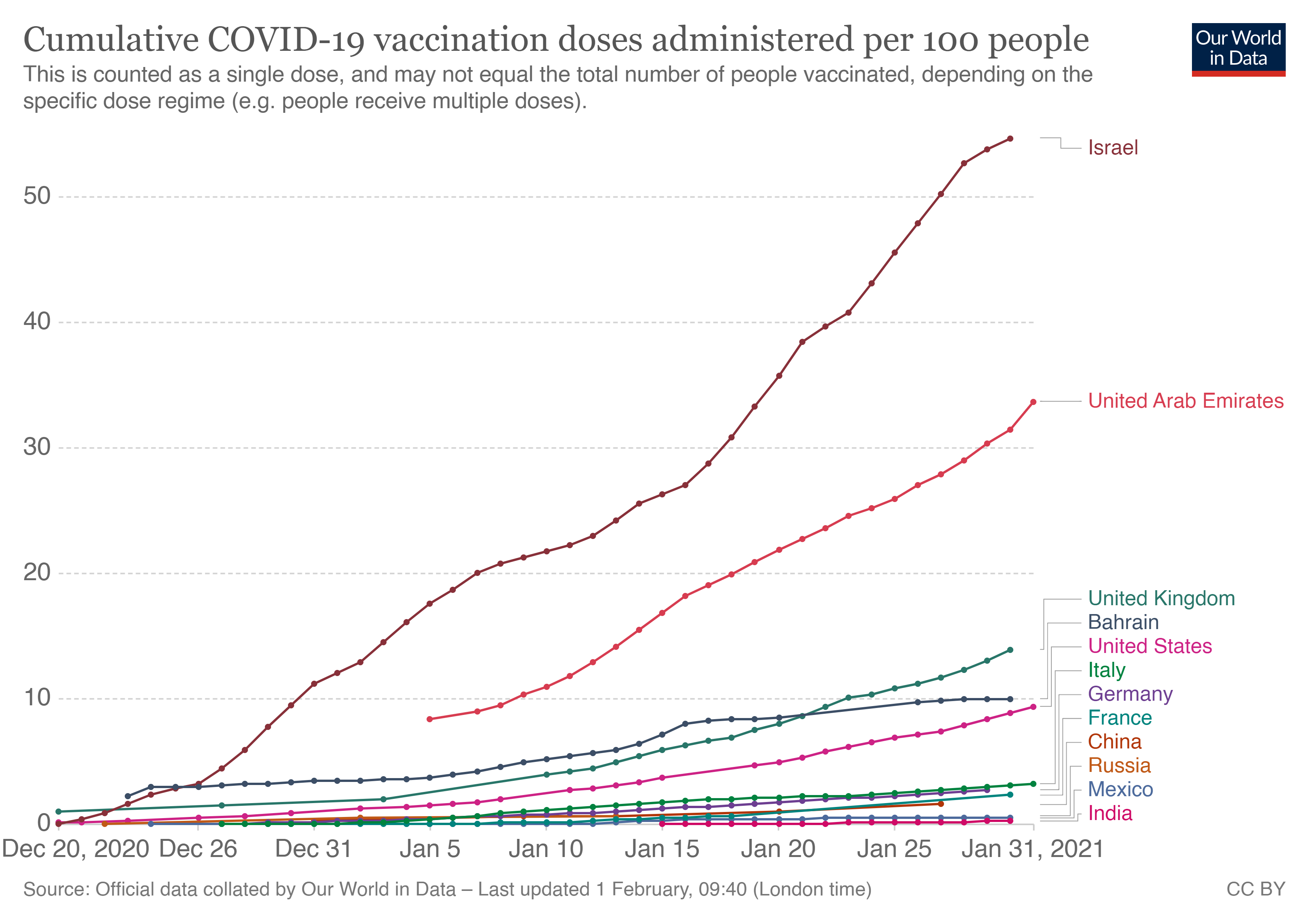
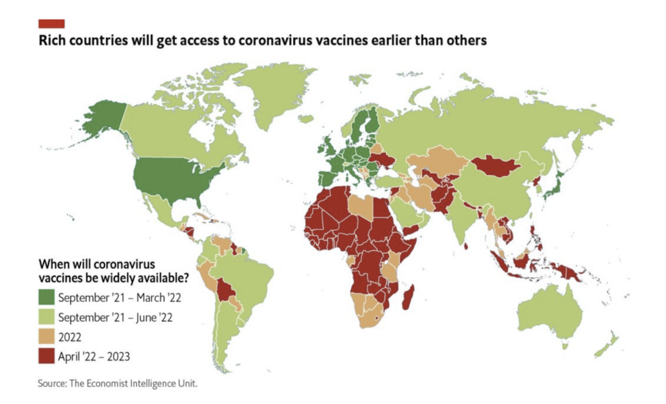
The line charts the world is obsessing over these days aren’t a race to flatten the curve. Instead, our attention is focused on a race to a herd immunity threshold that promises a return to some semblance of normalcy.

If you skip the rest of this article about the nuances and complexities of vaccination data, please remember this: all of the prevention measures (masks, distancing, hand washing) that we’re practicing now need to be part of our lives for the foreseeable future, particularly with new COVID-19 variants in circulation.
Listen to public health officials. Be hopeful and excited for this huge scientific milestone, but also remember, we still don’t have sound data on whether full vaccination prevents you from acquiring and transmitting the SARS-nCoV2 virus to others, even if you yourself don’t get sick.
For a year, we unpacked the complexity of COVID-19 case data.
Over the last year, there’s been a collective learning about the complexity of COVID-19 case data in the data visualization community.
What seemed like straightforward numbers (infections, recoveries) on the surface required more nuanced understanding, including factors like data collection methods, related metrics like the complicated test positivity rate, and the predictable peaks and valleys routine in health information reporting
I’ve developed charts of immunization coverage data many times while working on global health programs. Immunization experts corrected my missteps and helped me better understand uncertainty, denominator challenges, and data quality issues to monitor in coverage numbers. Vaccination data gets even more complex with multi-dose vaccines. As data journalists, health departments, and other sites launch trackers, the focus seems to be on the cheery cumulative climb of the ‘doses administered’ curve, which tells an incomplete story.
We can collectively benefit from becoming more informed readers (and creators, with the appropriate subject matter expertise) of data visualizations about immunization as COVID-19 vaccination trackers spin up. Here are nine considerations when reading or creating charts of COVID-19 vaccination data.
To read the nine considerations, click here.

You must be logged in in order to leave a comment